
dsh-model-provider-info
Manifest validShow the provider name before the model name in the DeepSeek Harness composer, marking non-DeepSeek routes with a coloured chip.
dsh-model-provider-info


Shows the provider name before the model name in the DeepSeek Harness composer's model seat, and gives third-party routes a visual weight of their own.
The composer names the current model in three places — the trigger caption, the root menu's
current value, and each selectable row — and by itself renders only the catalog model name. That
is ambiguous as soon as two providers offer a model with the same name. This bundle contributes
the conversation.input.model.label inline slot, so the same label reads
DeepSeek Account · DeepSeek-V4.1-Flash instead of DeepSeek-V4.1-Flash, and the reasoning
effort stays a separate caption beside it.
What it looks like
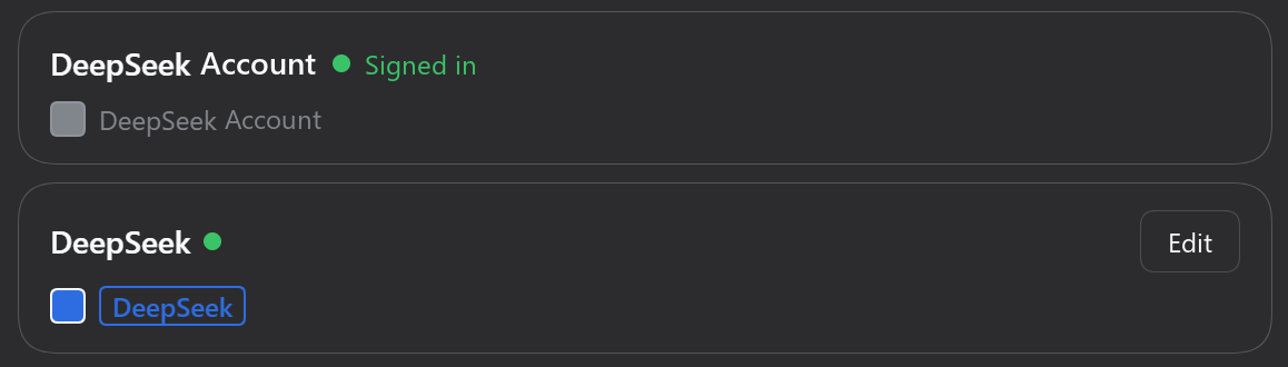
Every provider card in Settings → Models carries a single colour swatch and a preview of the name the composer will draw for it: the DeepSeek account row keeps the default grey text, while the DeepSeek API route shows the blue chip picked for it.
First-party vs third-party
deepseek-account and deepseek-official count as first-party; every other provider id is
third-party. The split follows the product's own ordering (provider-order.ts in
ui-model-selection, store.ts in ui-settings-models both special-case exactly these two
ids).
Emphasis is graded by surface, so the list does not become a wall of warnings:
| Surface | First-party | Third-party |
|---|---|---|
| Model trigger | plain caption text | #F61A43 outlined chip: 12px, weight 600, 1px border, --dsw-radius-xs, transparent fill |
| Menu "Model" value | same as above | same chip (this is also the current selection) |
| Expanded list rows | plain caption text | --dsw-alias-label-secondary + weight 500, no colour, no border |
The list rows are deliberately quieter: every group already carries its provider as a heading, so a chip per row would say the provider twice and paint the column red.
The catalog badge a provider attaches to a model (model.badge, the same Tag the built-in
label draws) is reproduced here: before the name in the trigger, after it in menus and rows.
Configuration
Settings → Models. Two places, stored per browser:
Every provider card ends with one colour icon: click it to pick that provider's colour, and it shows the colour in use (a heavier ring means the provider has its own colour rather than the default). Double-click it to go back to the default.
The bottom card sets the defaults:
| Option | Default | Effect |
|---|---|---|
| Default colour | #F61A43 | The icon picks it; used by every provider without a colour of its own |
| Colour the list rows too | off | Off: expanded rows differ by tone and weight only. On: they get the outlined chip as well |
| Show the provider on DeepSeek routes | on | Off: deepseek-account / deepseek-official show the model name alone |
Choosing a colour for one of DeepSeek's own routes also switches that route to the chip, since an explicit colour is a request to see it. Both surfaces share one live record, so changes show up in the composer immediately.
Install
dsh plugin --profile <profile> add dsh-model-provider-info
Desktop users install through Plugins → Add plugin instead; on a machine running DSH Desktop
the CLI command above targets profiles/web, not the profile the app uses.
From a checkout: dsh plugin --profile <profile> add link:/path/to/dsh-model-provider-info.
No build step, no runtime dependencies, no network access. Upgrading DSH does not remove it: it registers an official slot instead of patching a compiled bundle.
Deliberate trade-offs
#F61A43is the default accent — a literal colour rather than a theme token, because the user picks it. Everything else stays on tokens.- Outlined, not filled: accent text over a tint of its own hue loses about a fifth of its contrast, and the border alone already reads as a badge.
- 12px / 600 rather than the
Customtag's 11px / 400: the accent is a mid-tone at roughly 4.07:1 against the light card and 3.4:1 against the dark composer surface, which an 11px regular weight cannot carry. - The border is 1px, not 0.5px: at 100% DPI Windows renders a half-pixel hairline as a blur or drops it.
- The provider span stays a plain inline element so it shares the 13px model name's baseline.
- The glyphs are nudged up 0.5px (
position: relative): a line box splits the font's em square, not the ink, so 12px lowercase text inside a 1px border leaves roughly 8px above the letters and 4px below, while the dot of theiinzaireaches the ascender and pulls the other way. Half a pixel settles the ink at 7px above and 7px below — one device pixel on a 2x display — and moves only the ink: the border box and the baseline it shares with the model name stay put. - It needs no
priority: hosts from 0.2.1 onward have no built-in occupant on this single slot.
Limitations
- Display only. Selection, search, focus, check marks, the
/modelcommand popup and the trigger's accessible name stay owned by the model selector. - Preferences live in
localStorageunderdsh-model-provider-info/settings/v1, so they are per browser rather than per profile. - Long names still ellipsize inside the trigger; the chip and badge are part of that width.
Publishing
The package is published as dsh-model-provider-info on npm; repository, homepage and
bugs already point at this repository. To ship a change, bump version, then:
npm publish --registry https://registry.npmjs.org --access public
The package is unscoped, so --access public is implied; it is spelled out to make the intent
explicit. Keep the npm repository field pointing at the repository listed in the plugin
catalog, or the two will not be linked.
License
Comments
Loading…